For years, the direction of travel in design was fairly predictable: sharper, cleaner, more polished, more perfect. Every new tool promised to smooth things out a little further, and businesses were told that looking flawless was the way to look credible.
Something’s shifted this year, and it’s worth understanding, because it changes what actually makes a brand stand out.
A move away from the hyper-slick look
Creative directors across the industry are pointing to the same shift right now, a deliberate move away from that hyper-slick, machine-made look, towards work that feels like it was made by an actual person. Graham Sykes, global executive creative director at Landor, has given this a name, calling it Anti-AI Crafting, and he sees it as design’s answer to a world that’s saturated with algorithms.
Writing in Creative Bloq, Sykes described designers as “putting hands back on the work, literally”, pointing to hand-built sets, stitched texture, analogue surfaces, natural light, physical collage, ink, fabric and clay as the materials leading the shift. His argument is that as AI takes on more of the process, the marks an actual person leaves behind become the thing that stands out, proof that someone real was involved rather than just a prompt.
Why polish has stopped being impressive
It makes sense when you think about why it’s happening. AI tools can now produce something polished in seconds, which means polish on its own has stopped being impressive. When everyone can generate a slick graphic instantly, the businesses that stand out are the ones that feel unmistakably human, specific, and a little bit imperfect in a way that a prompt could never quite replicate.
A few live, example projects
Apple’s Apple TV intro – a manually operated camera circling a hand-blown glass apple, no CGI, which several creative directors pointed to as proof even the biggest brands are choosing the analogue route on purpose.
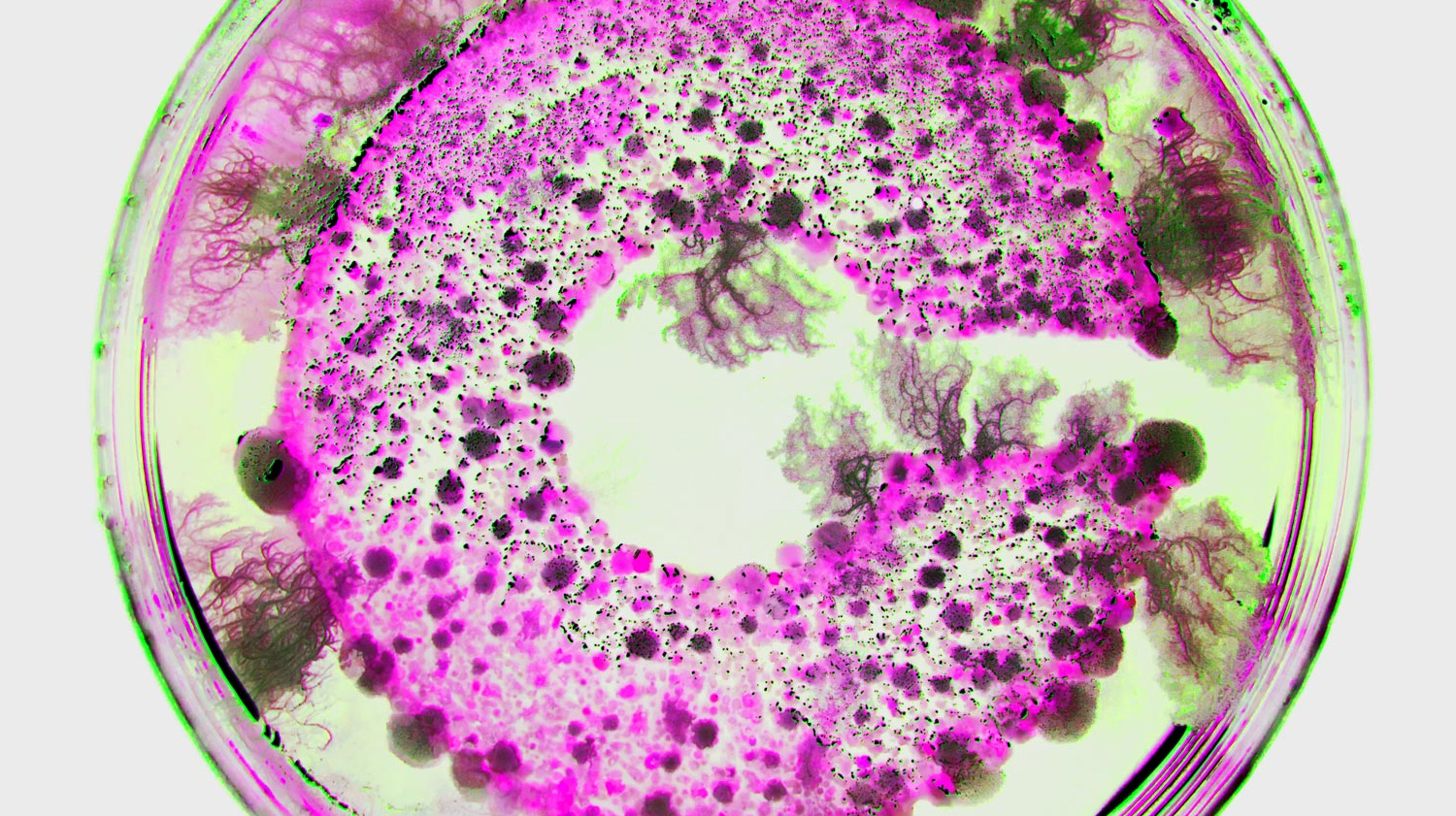
Madalena Studio’s work for Crucible – they grew bacteria on a cork logo, documented the organic growth, then hand-coloured the result into a full visual identity. About as literal a “made by hands” as you’ll find.
How&How’s branding for Big Cartel – built around a scrunched, scanned A4 printout, leaning into the DIY, independent feel rather than smoothing it out.
ALTO ROASTERS coffee brand identity and packaging by Catherine & Vlad of July Studio, a good small-brand example rather than a big-budget campaign.
Good news if your budget doesn’t stretch to glossy
For your business, this is good news, particularly if you’ve ever worried that your budget doesn’t stretch to looking as glossy as the big brands. Warmth and personality are pulling ahead of pure polish, and warmth and personality are things a small or independent business often has in far greater supply than a large corporate one does. Your story, your actual photos, your real voice, these are the assets that matter more this year, not less.
Scrappy isn’t the same as human
That doesn’t mean scrappy is automatically good, because there’s still a real skill in making something feel intentionally human rather than just unfinished. A slightly textured photo used well tells a story. A blurry, badly lit one just looks like nobody cared. The difference between the two is craft, and that’s exactly where a good designer earns their keep, knowing which imperfections to keep and which ones to fix.
Why now’s the time
If you’ve been putting off refreshing your branding because you assumed it needed to look flawless and corporate to be taken seriously, this is the year that assumption stops holding up. Your customers are increasingly drawn to businesses that feel real, and real is something you already are. The trick is making sure your design reflects that, rather than hiding it behind something generic.
We’d love to help you find that balance if you’re thinking about a refresh. Get in touch and we’ll talk through what it could look like for you.